InnoLegals – Immigration services in Spain
Website | Freelance projectProduct Designer
Figma, Design System
Solution prepared for: desktop, tablet, mobileProblem
Business challenges
From a business perspective, the main challenges were:
- too many manual consultations that could be automated
- not enough website conversion
- users avoided the dashboard
- no single source of truth for client data for employees
Advisors had to search through emails and chat platforms to find documents and messages, which slowed down their work and increased the risk of mistakes.
User problems
Through team discussions and internal insights, key user frustrations were identified.
Lack of transparency
Users weren’t sure:
- how the process looks step by step
- when they should apply in order to get their visa on time
- what visa exactly they would need
Because of this, users often felt lost and unsure about their next move. This uncertainty increased their dependence on advisors for basic information and reassurance.
Old website experience
- It was not clear what the next step should be
- The outdated design reduced trust
- Users hesitated to share sensitive data through the platform
- Poor visual hierarchy increased confusion
- Combined with complex legal processes, this increased fear of making mistakes
User behavior before redesign
- Not fully structured user journey
- WhatsApp, Telegram, and other external platforms
Users preferred direct contact instead of digital tools because the platform did not feel helpful enough.
Goals
Business goals:
- Increase paid conversions
- Reduce advisor workload
- Increase active dashboard users
What success meant:
- More users completing the Free Assessment
- Fewer repetitive questions for advisors
- The dashboard becoming the main communication hub between clients and advisors
Constraints
- Existing design guidelines that had to be respected
- Need to unify the design across 3 different products
- Requirement to extend and evolve the current brand system
- Low conversion and scattered communication channels
- Legal content and processes had to remain accurate and compliant
My role
I was responsible for the full design process:
- Informal UX research and internal discovery
- Product logic and user flows for:
- Website
- Free Assessment
- Dashboard
- Payments
- User redirection from website to dashboard
- UI design
- Creating a design system and component library for multiple brands
- Prototyping for developers
- Developer handoff with full documentation
- Partial frontend implementation
Scope of work
- Website information architecture (in collaboration with PM)
- Homepage and key pages (structure and visuals)
- Free Assessment (logic and UI)
- Dashboard UX & UI
- Content restructuring
- Design system for multiple brands
- UI implementation support
Strategy
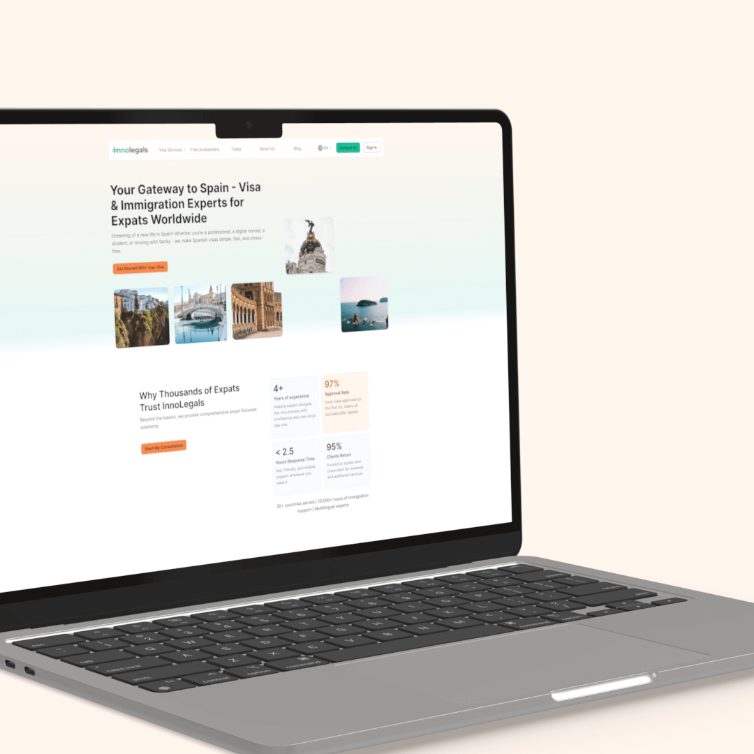
Website
The main purpose of the website became one clear action: request a call with an advisor and start the Free Assessment before that.
Instead of presenting only a list of services, I also redesigned the experience to guide users step by step. The goal was to help them:
- understand their situation
- find all essential information
- discover the right visa
- feel confident before contacting advisors
All CTAs, page layouts, and content hierarchy supported this primary goal.
Free Assessment
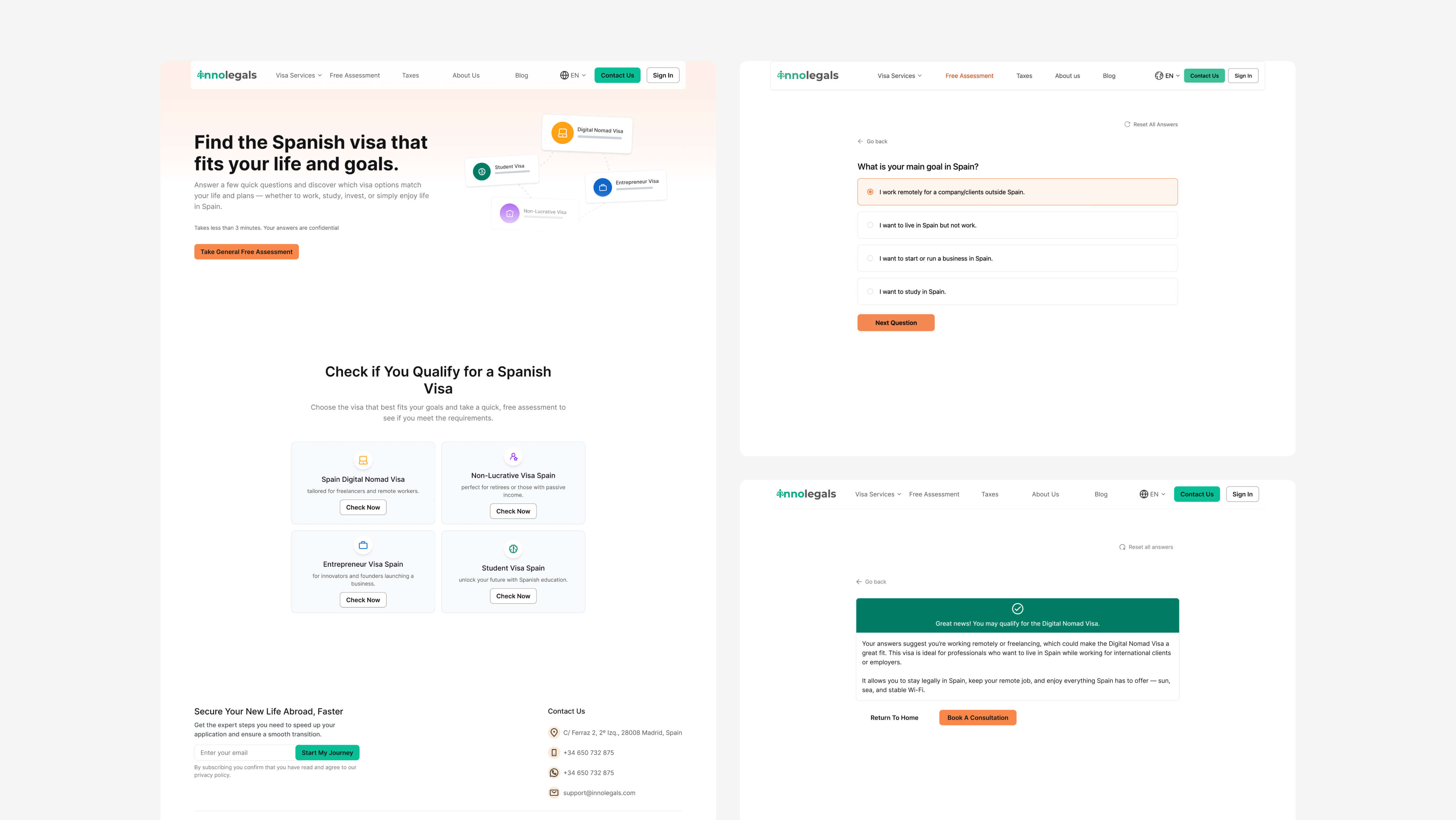
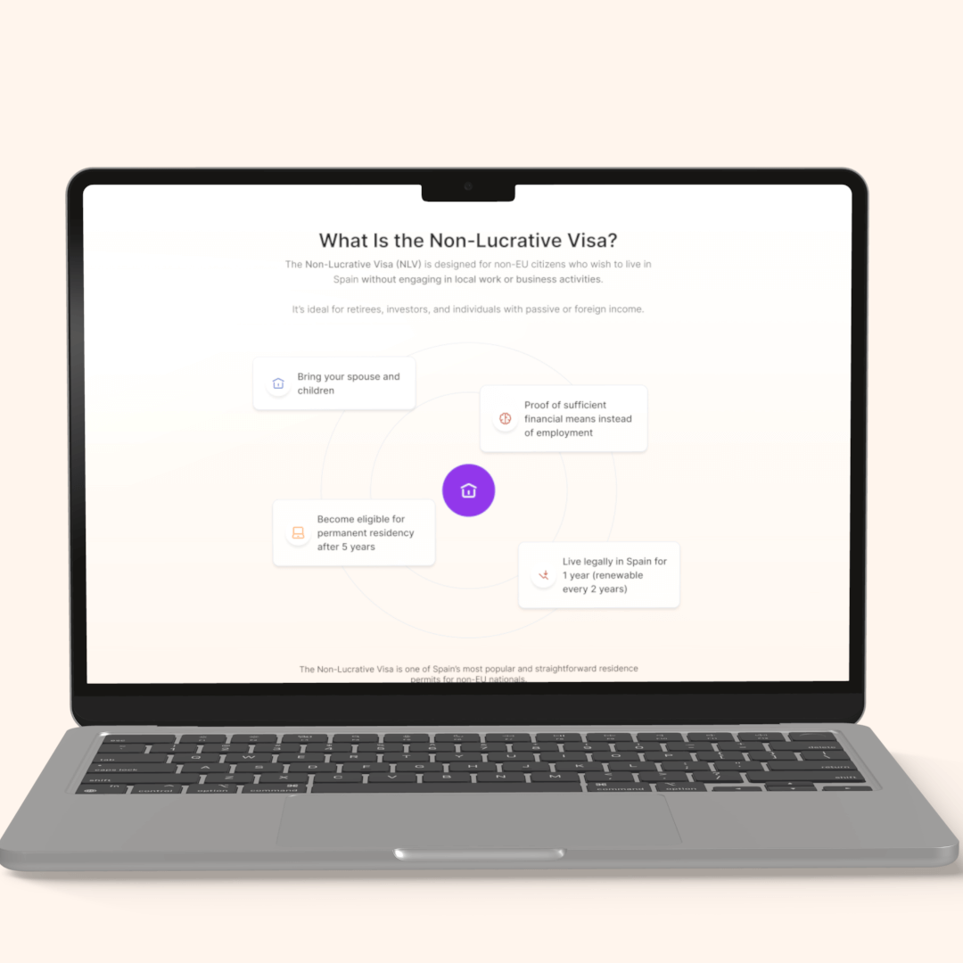
What is the Free Assessment?
The Free Assessment is an interactive eligibility tool that helps users understand:
- what visa they might qualify for
- whether they meet basic requirements
- what their next steps should be
It acts as a decision-support system before users speak to an advisor.
Why it was created
This feature was created to:
- reduce repetitive questions advisors receive
- pre-qualify leads before consultations
- give users clarity and confidence
- replace guessing with structured guidance
Instead of browsing multiple visa pages or booking calls without preparation, users can now get personalized guidance based on their situation.
Entry points
Users could start the assessment from:
- Homepage CTA
- Top navigation
- Footer
Logic design
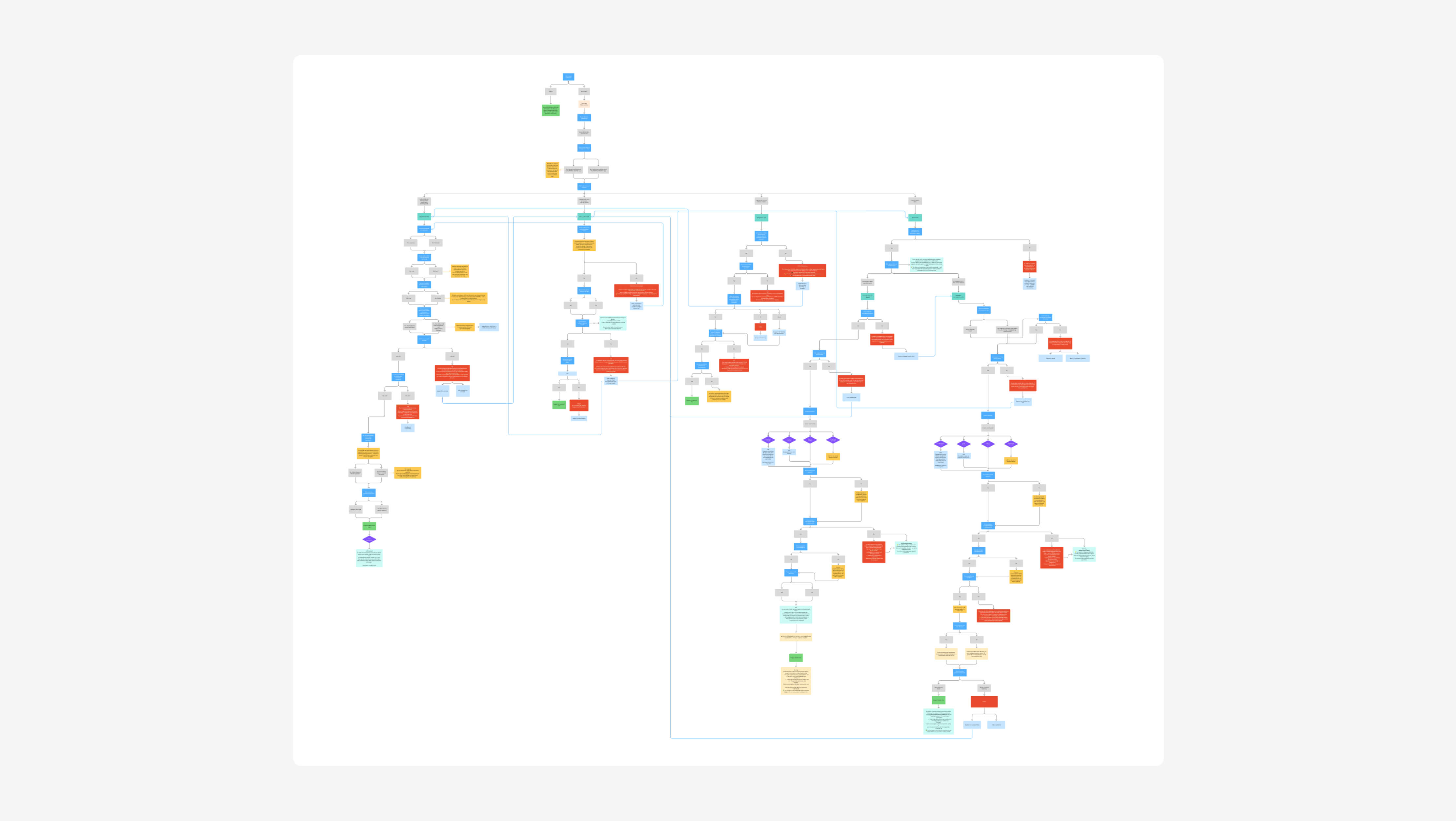
I designed the entire logic system behind the assessment.
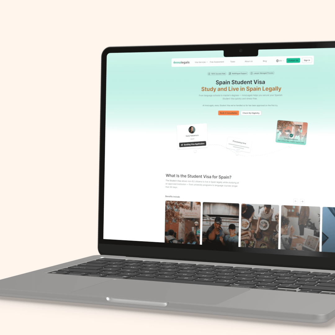
Branching logic
- Questions adapt based on user answers
- Example:
- If a user wants to work in Spain → the system excludes visas that prohibit employment
- The user is redirected to relevant visa types, such as the Digital Nomad Visa
Conditional flow
- Users only see questions relevant to their situation
- If an answer disqualifies them:
- they are informed immediately
- alternative options are suggested
Continuous guidance
- Each question explains:
- why it matters
- how it affects eligibility
- A clear step-by-step flow helps users feel in control
Flow length
- The number of questions depends on previous answers
- Some answers can end a visa path early if requirements are not met
End of flow
- Result screen
- Suggested visa type
- Option to contact an advisor
Key challenge
The biggest challenge was:
- Designing logic that works for many visa types
- Handling edge cases
- Keeping everything understandable for non-expert users
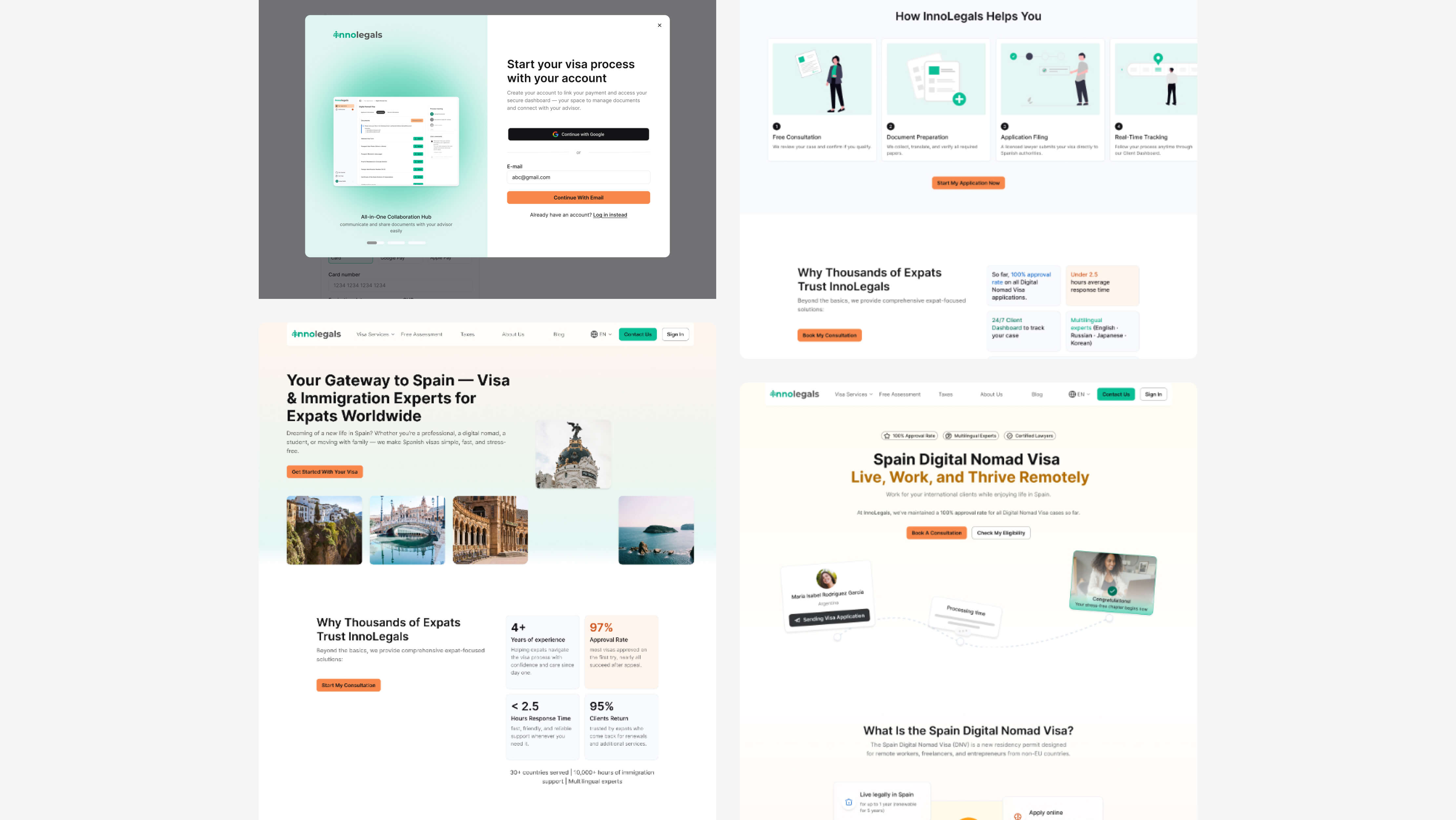
Dashboard redesign
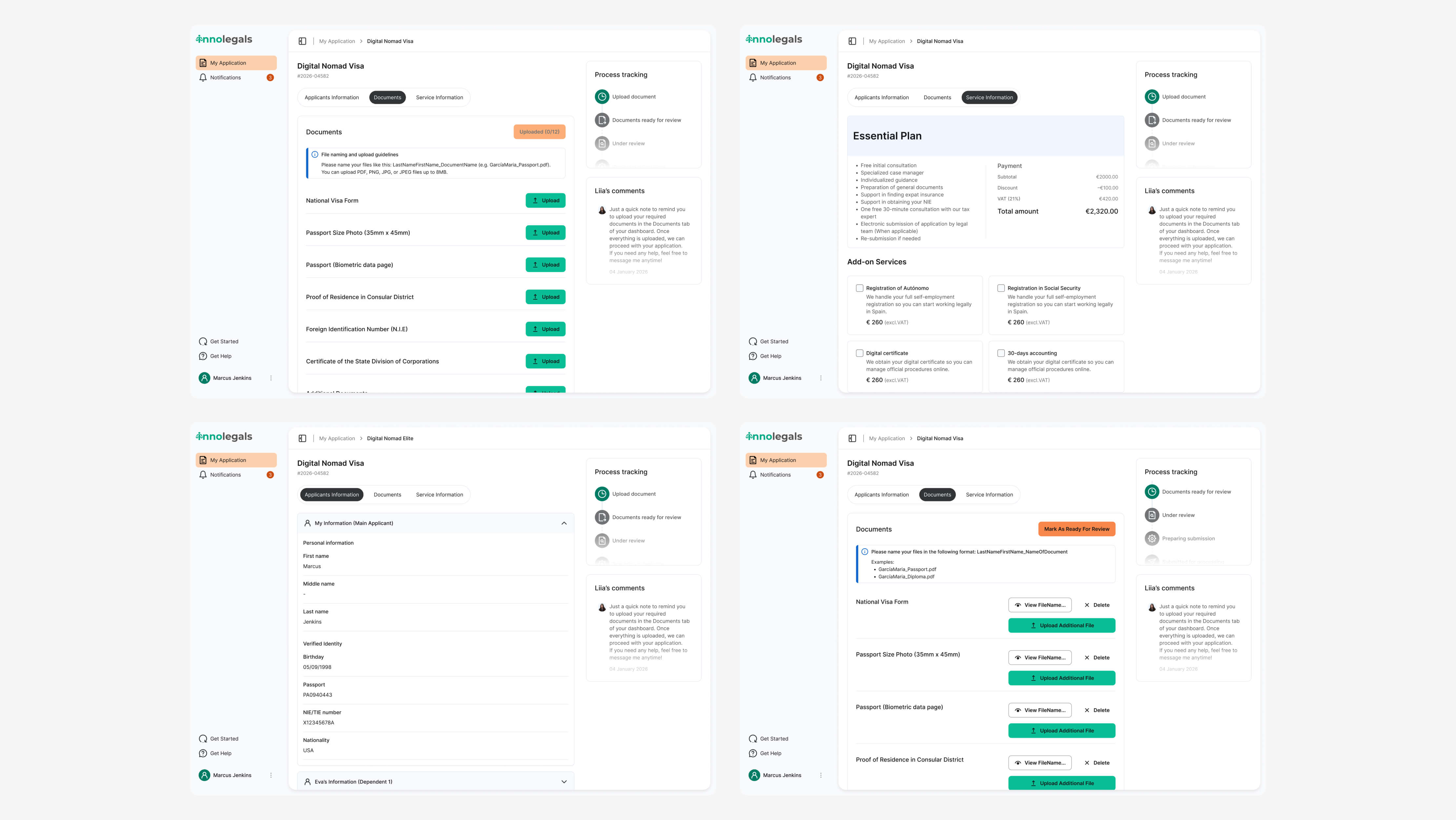
What is the Dashboard
The dashboard is a web platform that acts as a central hub for users during their visa application process. It allows users to:
- upload all documents required for their visa
- manage their application in one place
- track their application status step by step
- communicate directly with their assigned advisor
Instead of using emails, WhatsApp, or Telegram, users now have one structured and secure platform for everything related to their case.
Why it matters
The dashboard was designed to:
- reduce chaos caused by multiple communication channels
- create a single source of truth for users and advisors
- increase transparency in the process
- help users feel more in control of their application
For the business, it means:
- faster document collection
- fewer missed files
- better case organization
- easier internal collaboration
Problem
The dashboard existed, but:
- Users avoided it
- Information architecture was unclear
- Navigation and hierarchy were confusing
- Mobile experience was broken
- No clear value compared to email
What has been changed
Improved information architecture
- Clear and organized sections
- Better content hierarchy
Better guidance
- Microcopy
- Empty states
- Status feedback for user actions
New features
- Onboarding flow to introduce the dashboard
- Action feedback
- “Mark as ready for review” button
- Notifies advisors when all documents are uploaded
Core sections
- Application progress tracking
- Document upload
- Notifications
Adopting strategy
To encourage users to use the dashboard:
- Explained benefits during sign-up
- In-app onboarding
- Automated system emails
- Clear value messaging:
- faster feedback
- one place for everything
- direct communication with advisor
Results
Free Assessment
- 25% of website visitors start the assessment
- 80% complete the full flow
Dashboard
- The dashboard became the main communication hub
- Every new client now uses it
Internal feedback
- Advisors manage cases faster
- Fewer calls asking:
- “Which visa should I choose?”
- Communication is more structured
Impact
- Higher quality leads
- Reduced repetitive advisor work
- One centralized system for:
- documents
- communication
- application status
Conclusions
Biggest challenge
The biggest challenge was designing a flexible logic system that could handle multiple visa types and edge cases while keeping the experience simple and easy to understand for non-expert users. Balancing legal accuracy with usability required careful structuring and continuous iteration.
What I would improve
If I had more time, I would focus on improving keyboard navigation across the entire platform. This includes making sure all interactive elements are fully accessible without a mouse, adding clear and visible focus states, and ensuring a logical tab order throughout the interface. I would also test real user flows using only a keyboard to identify friction points and adjust components accordingly. Improving keyboard accessibility would make the product more inclusive and compliant with accessibility standards, while also creating a smoother experience for power users.
Key learnings
This project showed me that product success is not about building features, but about making sure users actually adopt them. Even the most powerful tool has no value if people don’t understand why they should use it. I learned how important it is to clearly communicate value, guide users through new experiences, and design onboarding as part of the product itself. This case also reinforced how closely UX decisions are connected to business outcomes, such as reducing operational workload and improving lead quality.