RawShare - a mobile app for people to share their leftovers to prevent food waste
Mobile App | School project turned into passion projectUX/UI designer, Front-end developer
Figma, FigJam
Explore the RawShare app Mockups | Component library | Foundation in Figma
Github repository Solution prepared for: mobile (iOS)The challenge
Our challenge was to create a product that could compete with existing products on the market like TooGoodToGo and Facebook Marketplace.
Research Methodology
User Interviews: We conducted in-depth interviews with a wide spectrum of participants, including regular individuals, administrators of food-wasting groups on social media, and representatives from local restaurants and cafes. These interviews provided us with a holistic view of user behaviors and pain points.
Focus Groups: Organized focus group sessions allowed us to facilitate open discussions and brainstorming, uncovering collective insights and perspectives.
Surveys: A structured survey was distributed to a broader audience, collecting quantitative data to identify trends, preferences, and behaviors related to food waste.
Competitor Research: In-depth analysis of competitors and similar platforms allowed us to identify industry best practices, differentiate our solution, and adapt strategies based on market trends.
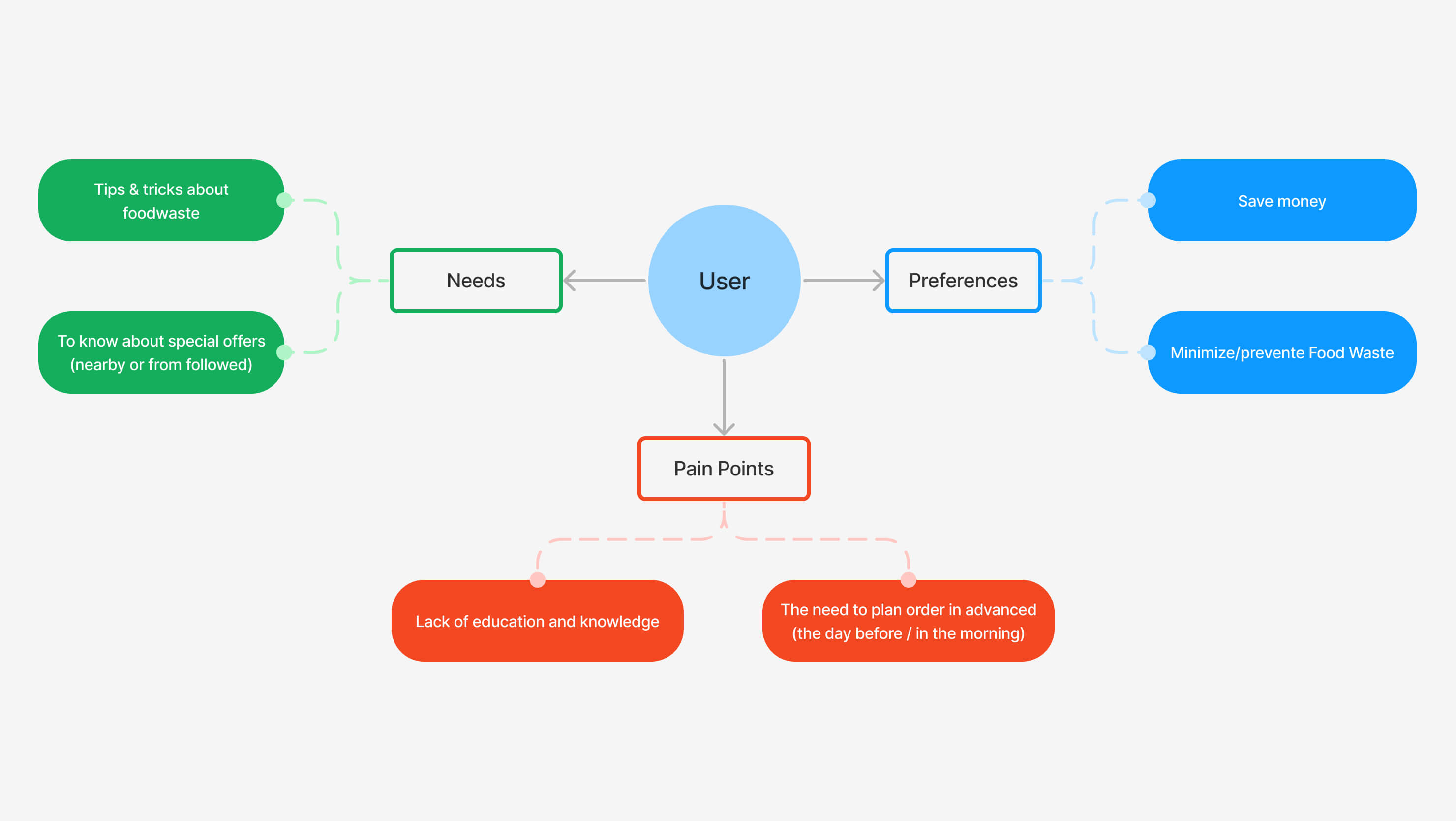
Mind-Mapping: Utilizing mind-mapping techniques, we visually organized and synthesized research findings, identifying patterns, connections, and potential design opportunities.
Personas: We developed detailed user personas to humanize our target audience, helping us make design decisions that align with their needs and motivations.
Key insights
From our extensive research, we derived the following key insights, which informed our design process:
- Diverse User Perspectives: Interviews provided a multifaceted understanding of the food-waste landscape, highlighting varying motivations, challenges, and behaviors.
- User Pain Points: Surveys and focus groups identified common pain points, such as confusion about food disposal guidelines and the need for a centralized platform to combat food waste effectively.
- Behavioral Trends: Our research illuminated trends, including users’ willingness to engage with a food-sharing platform and their preferences regarding UI design and functionality.
- Persona Alignment: User personas helped us align design decisions with specific user needs and motivations, ensuring a user-centric approach.
- Competitive Insights: Competitor research guided our strategic approach, allowing us to capitalize on industry best practices while introducing innovative features to differentiate our platform.
This comprehensive research approach and resulting insights were instrumental in shaping our design solutions for this project. While I can't disclose specific data or sensitive details, I am more than willing to discuss the research process and insights in greater detail during an interview or meeting.
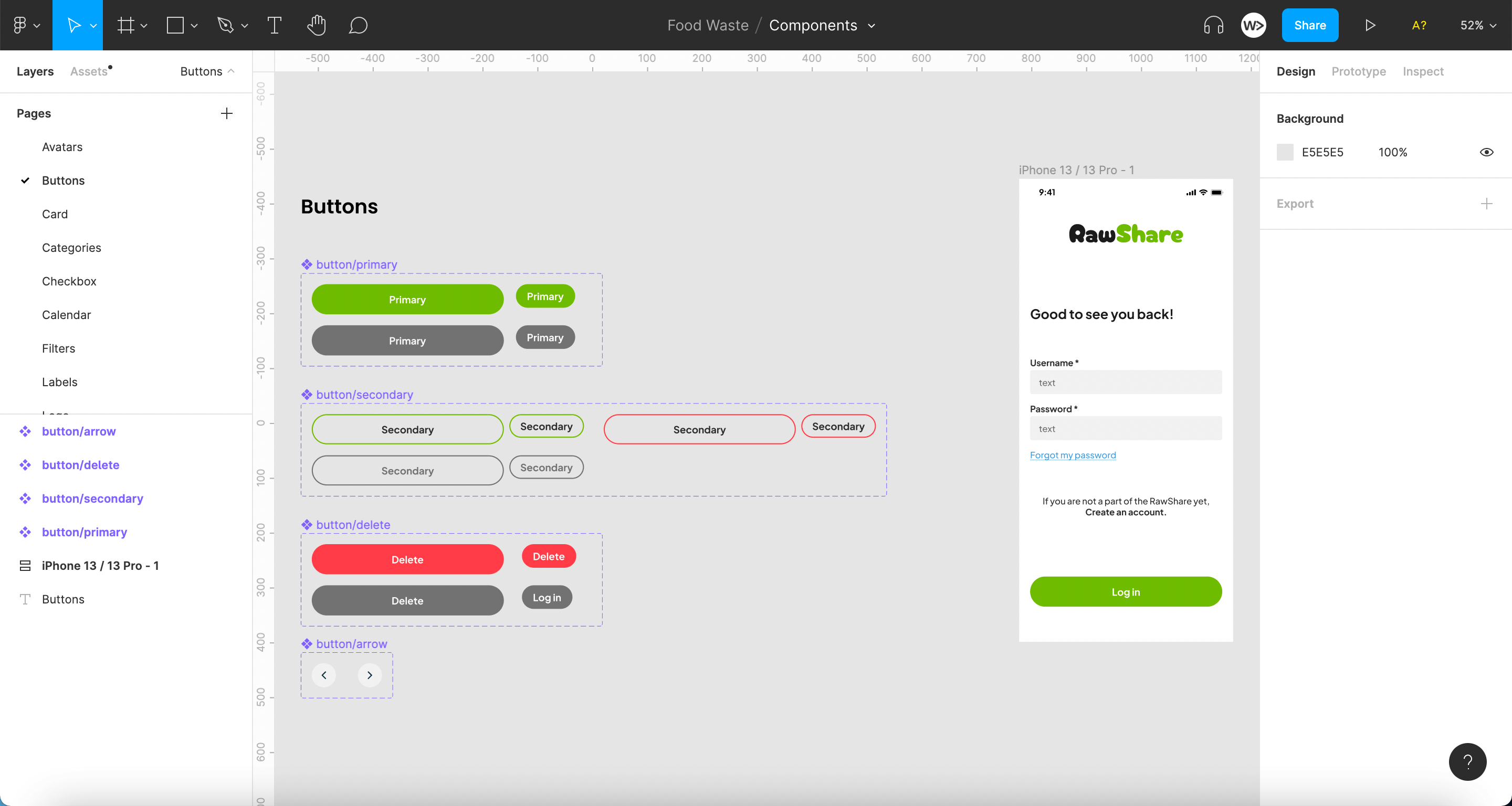
Design system
Design systems are essential for improving the design process workflow, communication between designers and developers, and maintaining consistency throughout the solution. Keeping this in mind, we created our own UI Kit which transformed into real Design System in version 2.0.
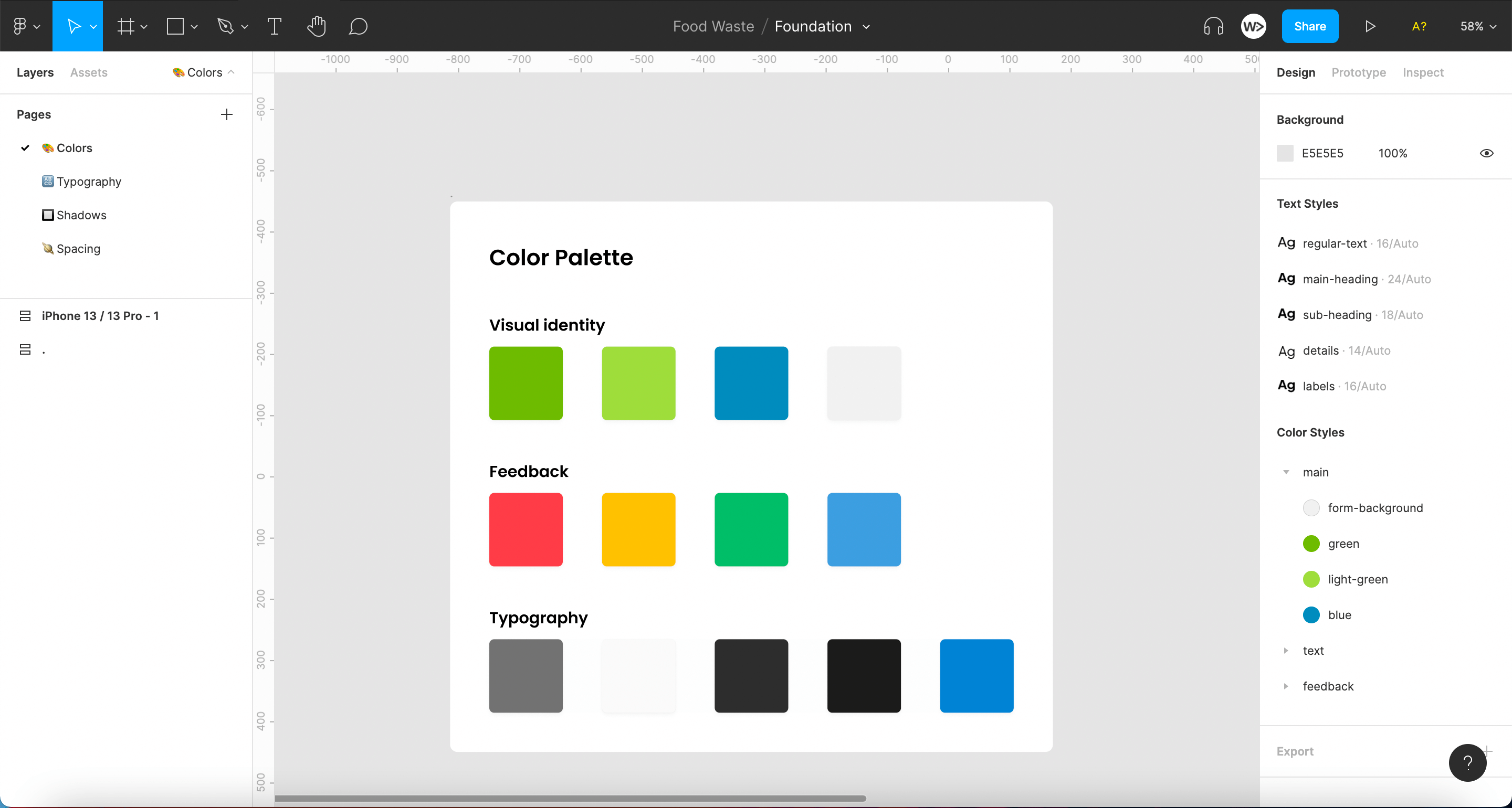
Foundation File: Contains information about the colors, fonts, and spacing used.
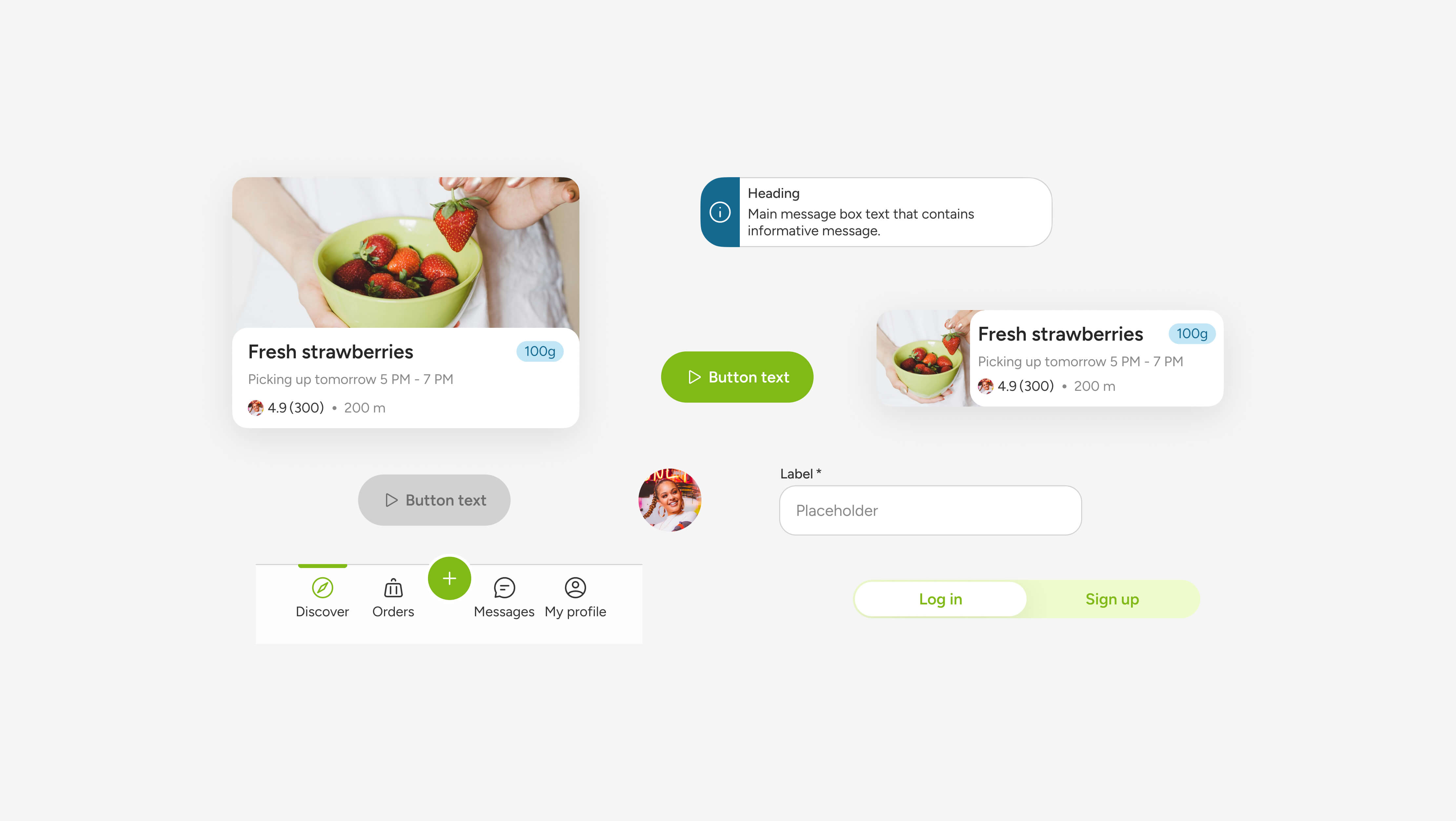
Components File: Includes reusable UI elements designed to maintain consistency.
Mockups File: Displays the final layouts and interactions.
Mockups
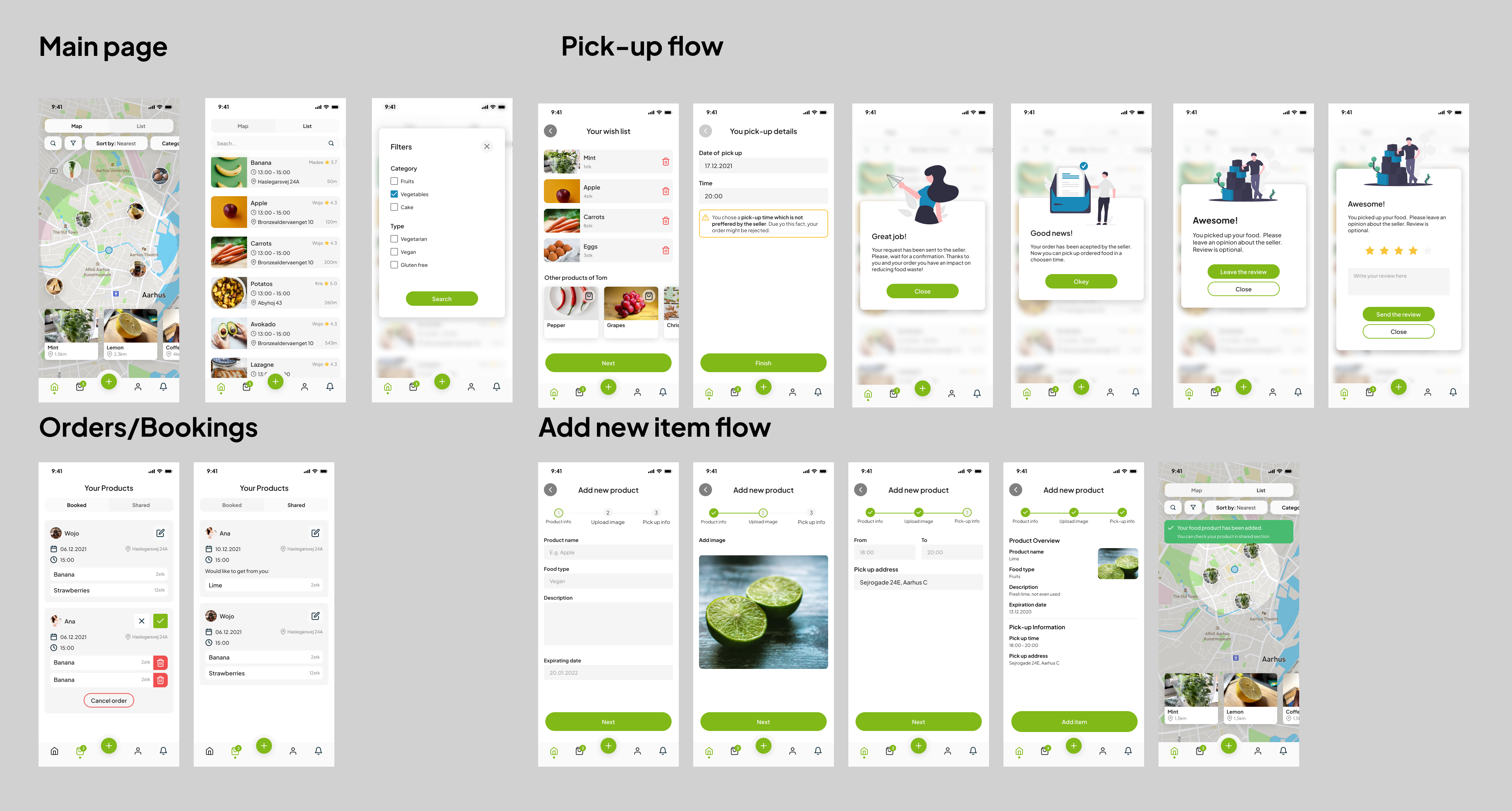
The app has been divided into four main sections:
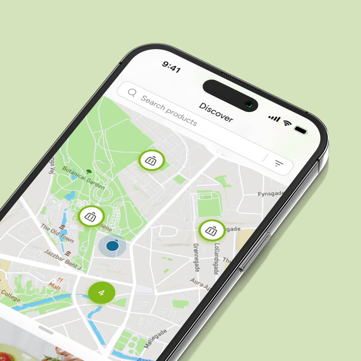
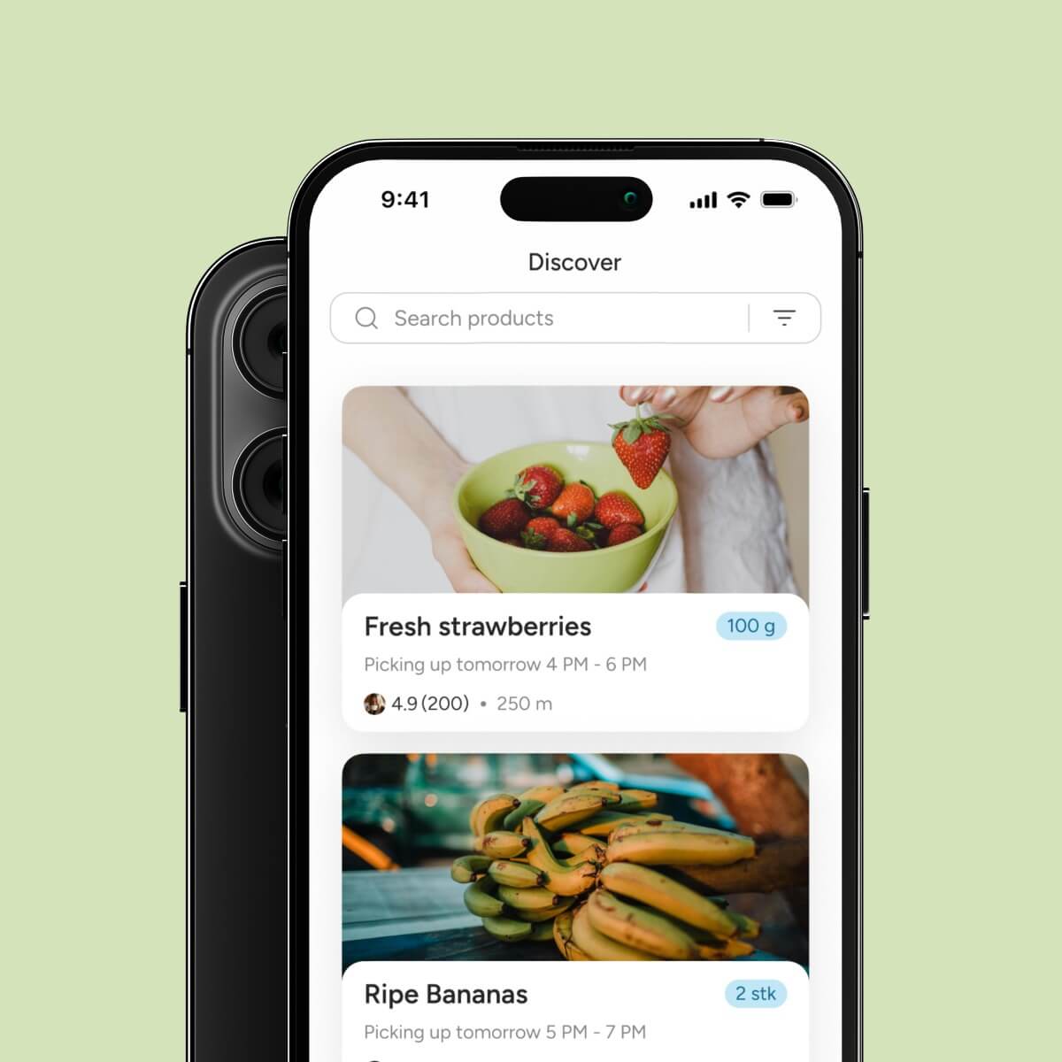
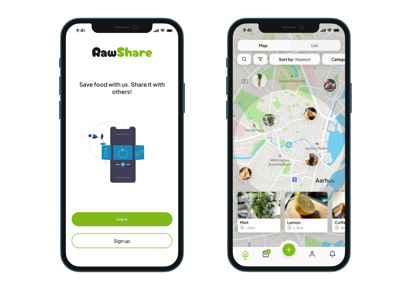
Main/Home Page:
- Users can check food items in their area using a map.
- Option to view all products in a list format.
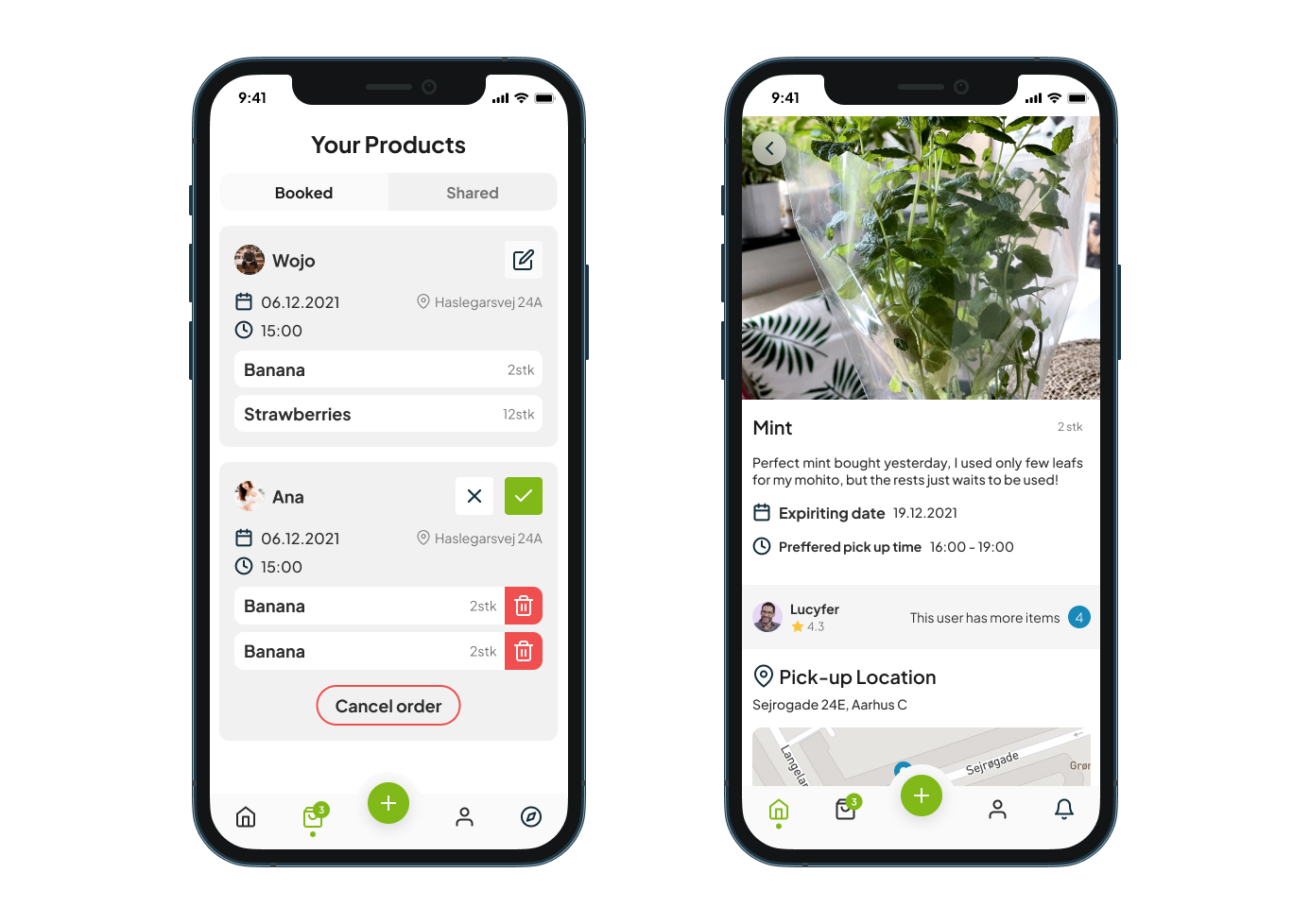
Booked/Shared Products Page:
- Contains a list of users’ requests for booking products.
- Includes requests from others who want to get food from the owner.
- Users can switch between orders easily.
- Activate the pick-up process 20 minutes before the set time.
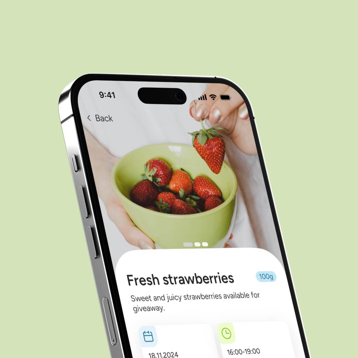
Add New Item Page:
- Users choose an item to add.
- Can select additional items from the same owner.
- Choose a day and time for pick-up.
Book Item Page:
- Users select an item and can add more items from the same owner.
- Choose a day and time for pick-up.
- Receive a notification if the chosen time doesn’t match the owner’s preferences.
RawShare 1.0 - final product
RawShare 2.0
Since the project hand-in, the app’s design and the entire design system have been updated. The app now provides users with an even better experience through a sleek and modern interface, improved navigation, new features, and enhanced accessibility. Key improvements include better color contrast, larger touch targets, and labeled navigation elements, making the app more user-friendly for everyone, including those with disabilities.
Design system 2.0
The RawShare design system has been rebuilt from scratch once again. The biggest change is that the entire foundation is now based on Figma variables such as colors, spacing, typography, and styles like shadows and effects. This update streamlines the design process, ensuring consistency and making collaboration between designers and developers more efficient.
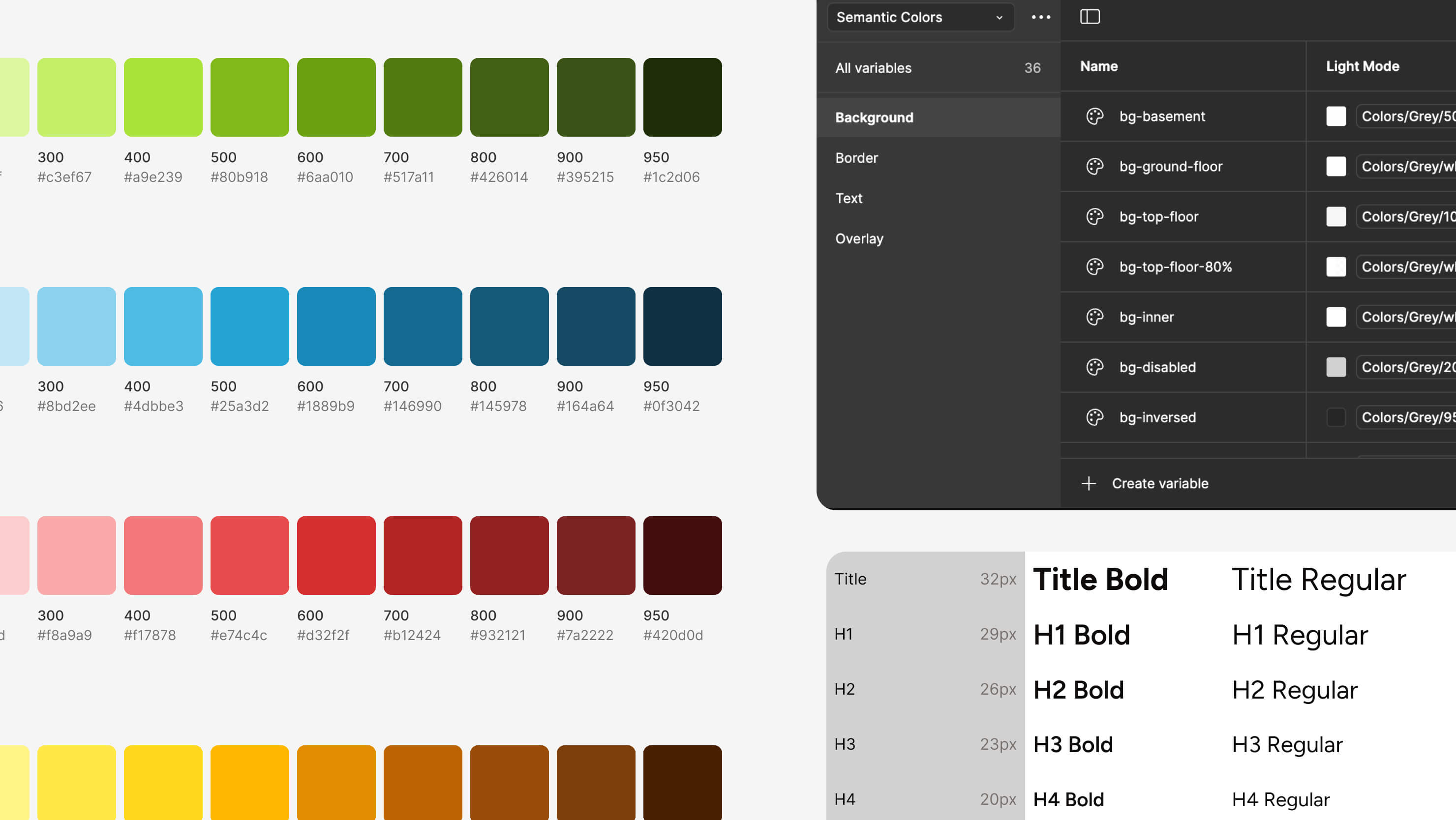
Foundation Section: Displays all fundamental information.
Component Section: Adheres to native iOS components, maintaining a unique identity while following iOS design principles.
Before and after
This section presents the transformations we have implemented to enhance the app’s flow and design. These updates underscore our commitment to user-friendly design and seamless functionality. As you explore the following sections, you will see steps that we have taken to exceed user expectations based on the gathered feedback.
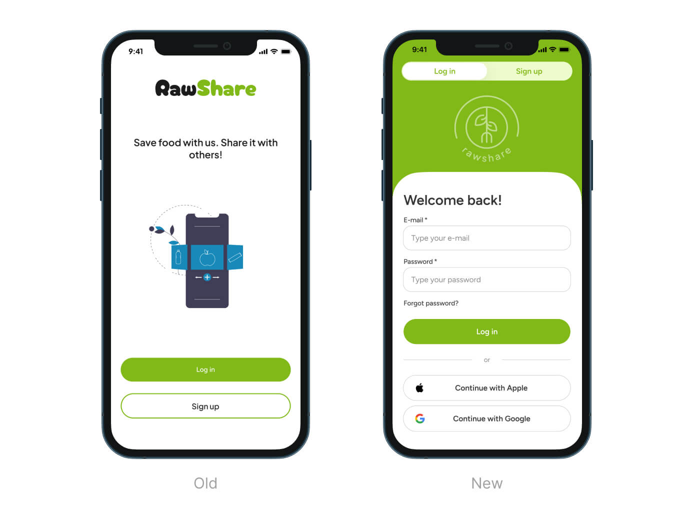
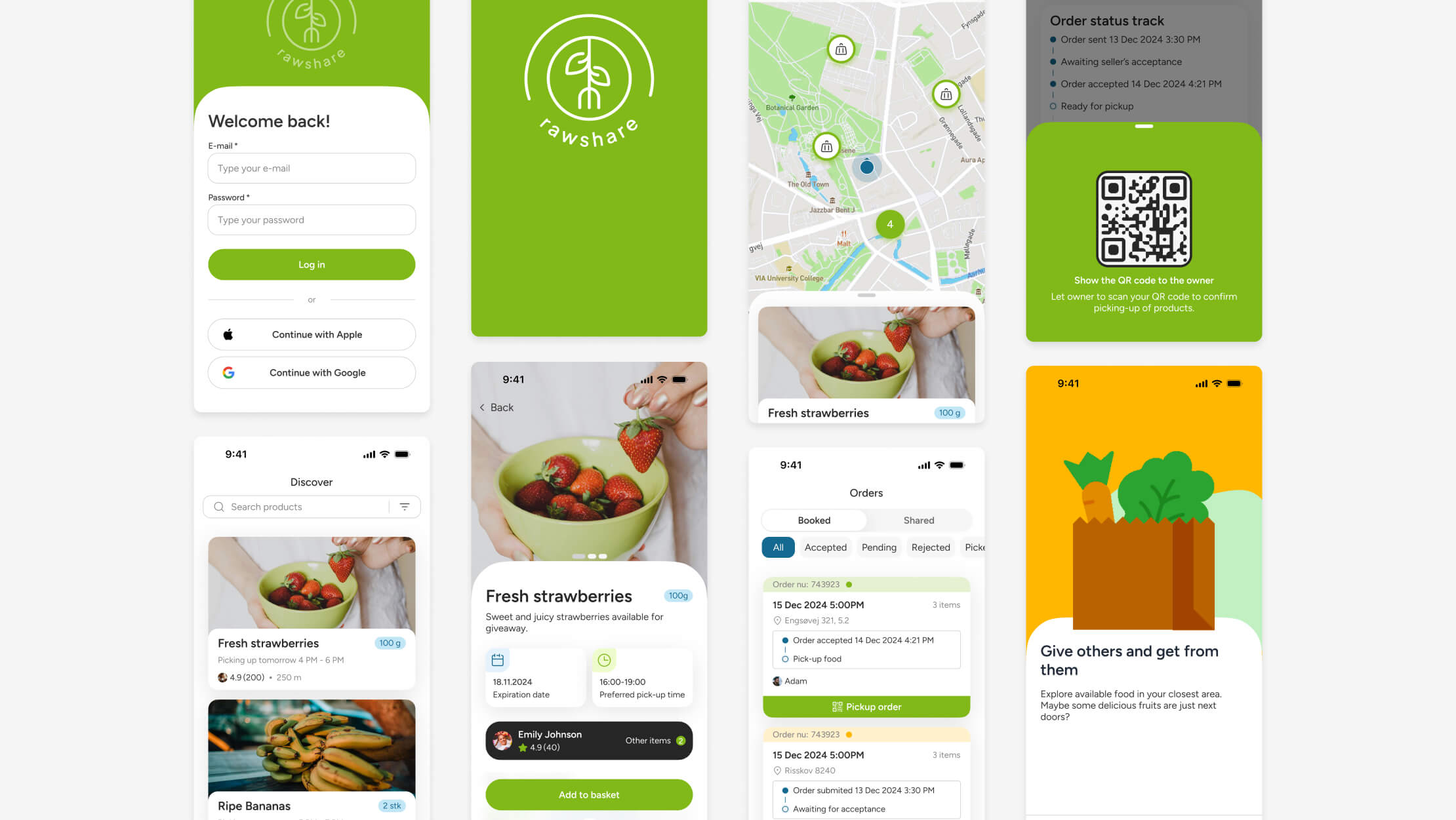
Start Page:
- Rebranded for a cleaner, more minimalistic look.
- Added social media sign-in options for smoother, more convenient login experience.
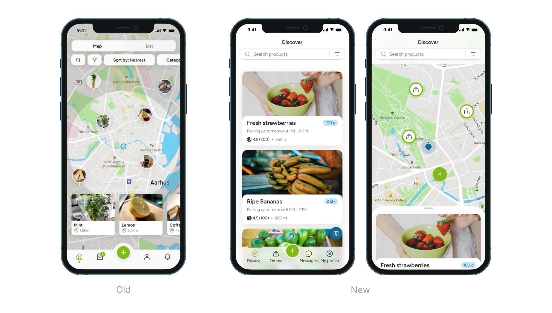
Home Page:
- Revamped flow with combined list and map views for a smoother experience and easier navigation
- Switch between views by dragging the list up or down.
- Navigation labels added for better accessibility.
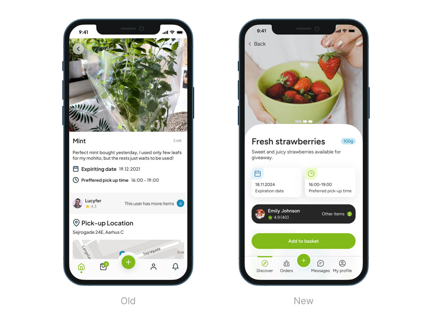
Product Page:
- Emphasized seller information for better recognition, helping users decide if the seller is trustworthy enough to get food from them.
- Highlighted seller’s pickup preferences, making it easier for users to adjust and coordinate when picking up food.
- Fixed “Add to basket” button to the navigation for easier access.
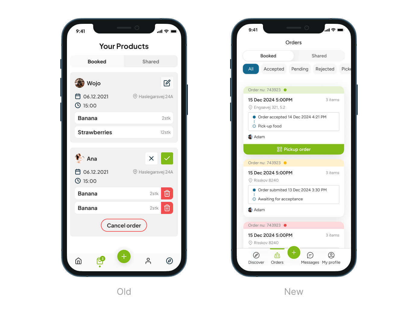
Orders Page:
- Orders categorized by colors for easier recognition of their status (e.g., pending, accepted, or rejected).
- Status track preview added for a quick look at the current step in the order process.
Of course, the presented images may not show every detail, flow, and aspect of the app. That’s why I invite you to visit our Figma file and check out the entire project there.
Conclusions
Working on the RawShare app has been a valuable experience, enhancing my skills in UX/UI design. The project emphasized the importance of comprehensive user research and a robust design system. These efforts resulted in a user-centric, innovative solution that effectively addresses food waste in local communities.